
Are you ready for a world where most people use their phones to surf the web? By 2025, having a mobile-first approach is a must. Since most users now access websites on their smartphones, a responsive and optimized website is key for a smooth experience.
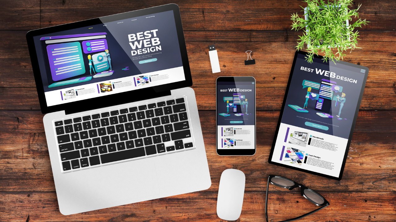
A mobile-first web design makes sure your website fits the most common user habits. It offers a better experience that boosts engagement and sales. In this article, we’ll see why a mobile-first strategy is crucial for your online success.
Key Takeaways
- A mobile-first approach is critical for catering to the majority of mobile internet users.
- Responsive web design ensures a seamless user experience across devices.
- User experience optimization is key to driving engagement and conversion.
- A well-designed website is essential for a strong online presence.
- Mobile-first web design is a game changer in 2025 and beyond.
The Mobile Dominance in 2025’s Digital Landscape
In 2025, the digital world is all about mobile devices. This change affects how we interact online. Businesses need to understand this trend to stay ahead.
Current Mobile Usage Statistics
Now, most internet traffic comes from mobile devices. Global mobile traffic trends show a steady rise. This is thanks to more smartphones and cheaper data plans.
Global Mobile Traffic Trends
Reports say mobile devices make up over 60% of web traffic. This number is expected to grow. Better mobile networks are driving this increase.
Industry-Specific Mobile Adoption Rates
Different industries adopt mobile at different rates. For example, retail has seen a big jump in mobile shopping. Many people like shopping on their phones for its convenience.
Shifting Consumer Behaviors
Mobile devices are now a big part of our lives. This change affects how we browse and shop online. People prefer mobile-friendly experiences.
Mobile Shopping and Browsing Patterns
Mobile browsing patterns show people are more likely to buy on impulse on their phones. This highlights the need for smooth mobile experiences.
Attention Spans and Content Consumption
The rise of mobile has also changed how we pay attention and consume content. Now, we expect content that’s short, engaging, and easy to read on our phones.
To make the most of these trends, businesses need to focus on mobile-friendly designs. Platforms like Fiverr and Fiverr Pro can help you find skilled designers for mobile-first projects. This way, you can keep up with the fast-changing digital world.
What Is Mobile-First Web Design and Why It Matters
In today’s world, mobile-first design is essential, not just a trend. With more people using mobile devices to surf the web, businesses must focus on mobile users first.
Definition and Core Principles
Mobile-first web design means designing for small screens first. Then, it scales up for bigger devices. This way, the most important features and content are always first.
Content Prioritization
Content prioritization is key in mobile-first design. It’s about figuring out what content is most important. Then, it’s presented in a simple and clear way.
Progressive Enhancement
Progressive enhancement is another important principle. It makes a website work better on advanced devices. But it still works well on simpler devices too.
Evolution from Desktop-First Approach
The move from desktop-first to mobile-first design is a big change. Before, websites were made for desktops, with mobile an afterthought.
Historical Design Paradigms
Desktop-first design was common. Websites were built for big screens, then made to work on smaller ones. This often made mobile use less good.
The Shift to Mobile-Centric Development
Now, the focus is on mobile-centric development. This means making websites work well on mobiles first. Then, they’re improved for bigger screens.
Key Benefits of Mobile-First Web Design in 2025
Mobile-first web design is changing the digital world in 2025. It brings many benefits to businesses. By focusing on mobile users, websites become better for smaller screens and touch.
Improved User Engagement and Retention
A mobile-first design makes websites easy to use on phones. With easy navigation and fast loading times, users enjoy their visit. This makes them more likely to come back.
Faster Loading Times and Performance
Mobile-first design makes websites load fast on phones. It focuses on performance optimization. This means sites load quicker, making users happier.
Reduced Bounce Rates and Higher Conversions
Good mobile design keeps users on your site longer. This leads to more sales and engagement. It’s key for businesses wanting to grow.
Case Studies and Success Metrics
Many companies have improved with mobile-first design. For example, an e-commerce site saw 25% more sales. Another company’s bounce rate dropped by 30%.
| Benefit | Pre-MFWD | Post-MFWD |
|---|---|---|
| Conversion Rate | 2% | 2.5% |
| Bounce Rate | 40% | 28% |
| Load Time (seconds) | 5 | 2 |
Technical Implementation of Mobile-First Design
Creating a mobile-first design is key for a smooth user experience on all devices. You’ll learn how important responsive frameworks and technologies are in this process.
Responsive Frameworks and Technologies
Responsive frameworks are the base for adaptable layouts. CSS media queries and flexbox are two main technologies that make this possible.
CSS Media Queries and Flexbox
CSS media queries let you change styles based on screen size or device. Flexbox helps create layouts that fit the user’s screen well.
For example, media queries can adjust layouts for smaller screens. Flexbox makes sure content fits well in those layouts.
Modern Framework Solutions
Frameworks like Bootstrap and Tailwind CSS make development easier. They offer pre-made components and tools for responsive designs.
Progressive Enhancement vs. Graceful Degradation
Choosing between progressive enhancement and graceful degradation is important in mobile-first design. Progressive enhancement builds a basic site that works for all, then adds more features for better browsers.
Implementation Strategies
Progressive enhancement makes your site work on many devices and browsers. You need to know what different browsers can do.
Testing Methodologies
Testing is crucial for a great user experience. You should test your site on various devices, browsers, and network conditions.
By using these strategies, you can make a mobile-first design that works well and is easy to use.
Mobile-First Design and SEO Advantages
The move to mobile-first design is more than just about making websites easier to use. It also has big SEO implications. As search engines like Google keep getting better, having a website that works well on mobile is more important than ever.
Google’s Mobile-First Indexing
Google now focuses on the mobile version of your website first. This change highlights the need for a smooth mobile experience.
Algorithm Updates and Implications
Google updates its algorithms often to make search results better. These updates usually highlight the need for fast mobile sites and good user experience. To keep up, you need to stay active in updating your website.
Impact on Search Rankings and Visibility
A mobile-first design can really help your search rankings and visibility. Here are some important points to remember:
- Page loading speed
- Mobile usability
- Content accessibility
Performance Metrics That Affect SEO
Several performance metrics can impact your website’s SEO. These include:
- First Contentful Paint (FCP)
- Time to Interactive (TTI)
- Total Blocking Time (TBT)
Core Web Vitals Optimization
Core Web Vitals measure how well a webpage works for users. Making these vitals better is key to boosting your website’s search rankings and visibility.
Enhancing User Experience Through Mobile-First Approach
Most people use the internet on their phones. So, making websites mobile-friendly is key for a good user experience in 2025. This approach makes websites easy to use and fun on mobile devices.
Intuitive Navigation and Interaction Patterns
Designing for phones means making things easy to use. This includes:
- Simple and consistent menu structures
- Prominent call-to-action buttons
- Gestures and touch-friendly elements
Touch-Friendly Design Elements
Using touch-friendly design elements makes websites better. Buttons and interactive parts should be big and easy to tap. The site should also work well with touch.
Content Prioritization Strategies
Choosing what content to show first is important. Focusing on the most important stuff makes websites easier to use.
Visual Hierarchy for Mobile Users
A good visual hierarchy helps users see what’s important. It uses size, color, and where things are placed to draw attention.
Accessibility Considerations
Mobile design must be accessible to everyone. This means making sure it works for people with disabilities too.
Inclusive Design Principles
Following inclusive design principles makes websites better for everyone. This includes things like color contrast, font size, and how well it works with screen readers.
| Design Element | Mobile-First Consideration | Benefit |
|---|---|---|
| Navigation | Simple and consistent menu structures | Improved usability |
| Buttons and CTAs | Touch-friendly design | Enhanced user engagement |
| Content | Prioritization and clear hierarchy | Reduced cognitive load |
How Fiverr and Fiverr Pro Connect You with Mobile-First Design Experts
Looking to improve your website’s mobile experience? Fiverr and Fiverr Pro connect you with top mobile-first design talent. These platforms change how businesses find and work with skilled designers for mobile experiences.
Finding the Right Mobile-First Designer on Fiverr
Fiverr’s big marketplace lets you explore many designers’ profiles. It’s key to find the right one for your project. When searching, carefully check their portfolio.
Portfolio Evaluation Tips
- Look for designs that are responsive and visually appealing on mobile devices.
- Check for experience in your industry or with similar projects.
- Assess the complexity of their past projects and their ability to handle your needs.
Budget Considerations and Packages
Fiverr has many pricing options, from basic to premium. Think about your budget and what expertise you need when picking a designer.
Benefits of Working with Fiverr Pro Verified Designers
Fiverr Pro connects you with top, vetted professionals. Working with Fiverr Pro designers means better quality and expertise.
Quality Assurance and Expertise Vetting
Fiverr Pro designers go through a tough vetting process. They make sure they have the skills and experience for complex projects.
Collaboration and Communication Advantages
Fiverr Pro makes working together easy. It ensures your project is done right and you’re happy with it.
Conclusion: Embracing Mobile-First as the Standard for Future-Proof Websites
As you move forward in the ever-evolving digital landscape, adopting a mobile-first design strategy is crucial. It helps create future-proof websites that meet the evolving needs of your users.
By prioritizing mobile-first design, you ensure a seamless user experience. This improves your website’s performance and keeps you ahead of the competition. It’s key for businesses aiming to thrive in a rapidly changing digital world.
A well-implemented responsive web design caters to the growing number of mobile users. It also helps in user experience optimization, keeping your audience engaged.
In conclusion, making mobile-first design a standard for your web development is vital. It’s essential for creating a strong online presence and driving long-term success.